
Black and white art fits in just about anywhere, but the wrong frame can throw it off completely. I’ve seen so many people ruin a great picture with poor framing.
The good news is, it doesn’t take much to get it looking right. You just need to keep things simple and make a few easy choices.
You don’t need fancy materials or loads of money either. A few tweaks can make a big difference.
In this post, I’ll show you ten ways to frame black and white art using my own drawings as examples.
These are things I’ve done myself. They work.
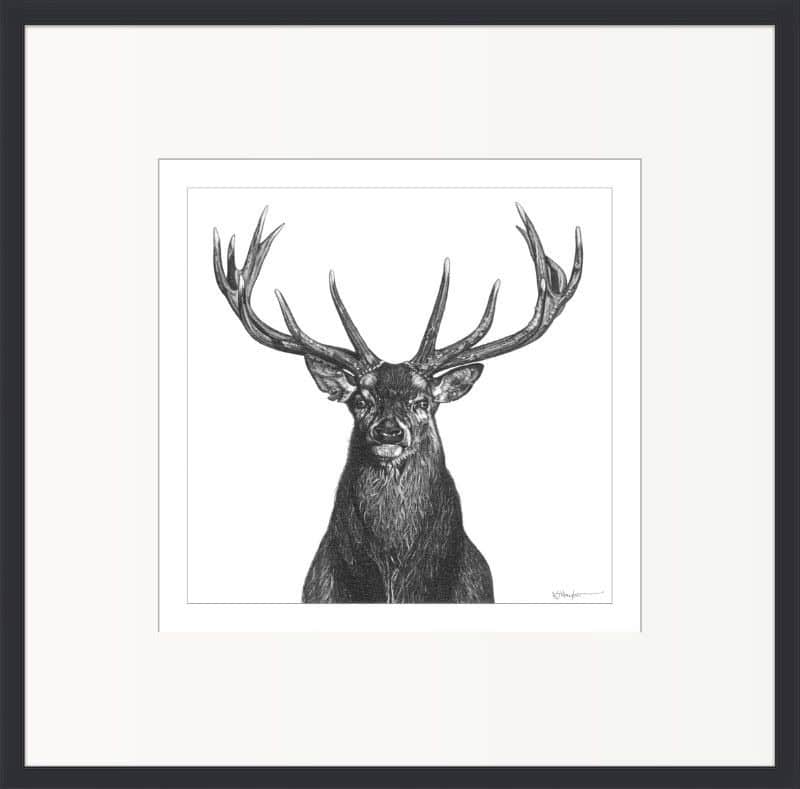
1. Keep it Simple With a Thin Black Frame

Mounted with watercolor paper
Let’s start with the obvious one. A thin black frame is the go-to for black and white art. It’s clean, unfussy, and puts all the attention where it should be, on the image.
Done well, it makes an instant statement. It looks deliberate, tidy, and sharp. It works with just about any subject, any style, and any wall.
But here’s the catch, and it’s a big one.
The number one mistake I see is sticking a black and white print straight into a thin black frame. No mount, no border, just crammed in. It looks pinched and cheap.
Another common mistake is framing a print in the smallest frame possible and centering it with uneven borders. It throws the whole thing off and makes the thing feel like an afterthought.
Buying a slightly bigger frame is key.
If you’re not using a mount, the print must have wide, even borders to give it space and presence. Without that, it just looks like it doesn’t belong in the frame.
If your print doesn’t have wide enough borders, there’s an easy fix. You can make your own by using a sheet of watercolor paper.
Cut an aperture in the center using a sharp blade and a metal ruler. Make the opening slightly bigger than the image itself. That way, you’ll get a clean white edge showing all the way around.
It gives the illusion of a custom mount and completely changes how the picture feels. It adds space, looks thoughtful, and makes a basic frame look far more expensive than it really is.
It’s a simple trick that works and doesn’t cost much at all.
2. Use a Mount, But Be Careful With Pure White
Simple Off-White Mount
A mount gives black and white art room to breathe. It separates the image from the frame and helps draw the eye to the artwork. But choosing the right color is more important than people think.
A pure white mount might seem like the obvious choice, but it often makes the artwork look cold. It can work well with bold black and white photography with dynamic contrasts..
But drawings are different.
Even the darkest pencil work is never truly black. Against a bright white mount, the tones can end up looking dull and subdued.
The better option is an off-white or ivory mount. It’s still neutral, so it won’t interfere with the image, but it has just enough warmth to lift the piece without overpowering it.
It’s a subtle difference, but it makes a big impact. Everything looks more balanced, and the artwork feels more finished.
3. Try Charcoal or Dark Wood Instead of Harsh Black

Rhino Drawing in a Wooden frame
Black frames are popular, and they can work, but they’re not always the best choice. Sometimes they’re just too harsh, especially for pencil or charcoal drawings.
If the tones in your artwork are soft and subtle, a jet black frame can overpower the image and pull your eye straight to the edge. It can feel heavy and too bold for the job.
A better choice is a charcoal grey frame. It still gives you that clean, modern look but with a softer edge. It complements pencil work without fighting it.
Natural wood frames are also a great option. I don’t usually recommend light wood though. It can look weak and doesn’t always sit well with black and white art. There’s not enough contrast, and it can make the whole piece feel washed out.
I prefer mid to dark-toned wood. Something like walnut, teak, or even stained oak. These frames add warmth and depth without looking dated. They work well in traditional and modern spaces and suit the more muted tones of pencil drawings perfectly.
4. Use a Double Mount for a Subtle Lift

Double Mounted
A double mount is one of those little tricks that can make a big difference without being flashy.
You can keep it simple by using two layers of the same color. An off-white top mount with the same off-white underneath adds a touch of depth that helps the artwork sit nicely in the frame. It looks clean and considered.
Or you can add a bit of contrast by using a narrow black or dark grey inner mount. Just a few millimetres showing around the edge of the image is enough to give it a nice clean border.
That extra line around the picture adds a visual break between the art and the rest of the mount. It draws the eye in and helps define the image, especially if your drawing has soft pencil work or a light background.
Double mounting costs more, but it looks more finished and adds a bit of weight to the presentation. It’s one of those details that buyers notice even if they can’t quite put their finger on why.
5. Try a Black-Core Mount for a Sharper Look

Black-core mountboard
If you don’t want the hassle or added cost of a double mount, a black-core board is a simple alternative that looks great.
From the front, it just looks like a regular off-white mount. But once it’s cut, a thin black line appears around the edge of the image. That small detail gives the drawing a clean edge and helps it stand out.
It works really well with black and white artwork, especially if the tones are dark or dramatic. It gives the image more presence without needing two layers.
Black-core board does cost a bit more than standard white-core, but it’s still cheaper than double mounting. You get a similar effect for less money and less faffing around.
It’s a nice upgrade that gives your framing a bit more impact with very little effort.
6. Go for a Deep Frame to Add Depth

Deep Frame and mount
Sometimes a simple change in frame depth makes all the difference. A deeper frame creates space between the glass and the artwork, which gives everything a bit more presence.
It doesn’t have to be chunky or heavy. Even a slim frame with a deeper profile can make the piece feel more finished.
This works especially well when you’re using a mount. That extra space gives the artwork a bit of breathing room and stops it from looking pressed against the glass.
It also helps protect delicate mediums like charcoal, chalk, and pastel. If the surface is too close, static from cleaning the glass can actually lift the particles off the paper.
A deeper frame adds structure and gives the whole piece a cleaner, more professional feel. It’s a small tweak that goes a long way.
7. Minimalist Metal Frames Look Clean and Contemporary

Lion Portrait in a Metal Frame
Metal frames can be a good option for black and white art, especially if you want a clean, modern look. Aluminium frames are lightweight, affordable, and easy to use.
Matte black is always a safe choice, but antique or brushed silver can be surprisingly effective. It adds just enough contrast to lift the artwork without drawing too much attention. When it’s done right, the mix of cool metal and black and white tones can look sharp and deliberate.
Silver frames work especially well with bold black and white images that have strong contrast. Pair one with a black mount, and the whole piece has real presence. It’s a striking combination that suits graphic images or punchy photography.
They also work nicely on darker walls. A silver frame helps the picture stand out and gives it a cleaner outline.
I mostly avoid anything too shiny. Chrome works in some cases but on the whole, stick with brushed or satin finishes and keep the profile simple. The aim is to complement the artwork, not compete with it.
In short, metal frames are easy to work with, they last well, and they give black and white art a crisp, modern feel without going over the top.
8. Go Big with Oversized Mounts

Minimalist Frame and Large Mount
If you want your black and white artwork to look more expensive, use a mount that’s much larger than usual. A wide border around the image gives it a gallery feel and makes the whole piece look expensive.
This works especially well with minimalist interiors. The extra space draws attention to the artwork without needing anything more.
It’s all about proportions. A small print with a generous mount suddenly looks like a feature piece. It gives the image room to stand on its own and stops it from looking cramped.
Just make sure the borders are even, and if anything, leave the bottom one slightly wider. That old trick balances the frame when it’s hung at eye level and makes the picture sit better on the wall.
One more trick is to center the image in the top half of the frame and have an extra wide bottom margin in the bottom half. It is a common device for presenting small artwork in a much larger frame. It has a contemporary feel.
Oversized mounts are a simple way to make black and white art look clean, stylish, and far more expensive than it really is.
9. Use a Clip Frame with a Black Backing

Presented In a Clip Frame
If you want a simple, contemporary look without paying for custom framing, a large clip frame can work well in a home setting.
Choose a frame that’s bigger than your artwork and back it with black paper or card. The dark background will set off black and white art nicely and give the piece a bold outline.
You can center the image for a balanced, classic look. Or use the bottom weighting method I mentioned earlier, placing the picture slightly higher in the frame and leaving a wider space at the bottom. It’s a small change that makes the display feel more professional.
This approach is clean, affordable, and suits modern interiors. It’s also easy to change the artwork if you like swapping pieces now and then.
10. Match Frames for Groups and Sets

Simple Display Idea
When you hang more than one piece together, the quickest way to make them look like they belong is to use the same frame style, colour, and mount. It brings order and makes the group feel intentional.
Black and white art is perfect for this. Matching frames create a clean rhythm that guides the eye from one piece to the next.
You can hang in sets of three for a simple, balanced display. Three landscapes in a row work well above a sofa or bed. Three portraits in a vertical column can fill a narrow space and draw the eye upward.
Mixing formats can look good too. Two landscapes with one portrait in the centre makes a strong trio. Reverse it for a different effect, with two portraits flanking a landscape in the middle.
If you have more pieces, a gallery wall can work well. Keep the spacing even and let the frames match so the layout feels calm rather than chaotic. You can combine different size together as one display.
It’s also a great way to display several smaller works together without them looking lost on a big wall.
The artwork can vary in subject or tone, but matching the frames and mounts pulls everything together into a single display.
Framing Black and White Art: Final Thoughts
A frame should feel like part of the artwork, not an afterthought. With black and white pieces, every choice stands out more because there’s no colour to hide behind.
Take your time when deciding on the frame, mount, and layout. Think about the room it’s going in and how it will sit alongside other pieces. When everything works together, the art has more impact and the space feels more considered.
In the end, the right frame completes the picture. It’s part of the overall design and plays just as much of a role in how the artwork is seen as the image itself.
If you like the way I draw and want to try things for yourself, this is my basic kit

If you enjoyed this post, here are a few more that will interest you:
- Repair Damaged Drawing Paper – 8 Ways to Rescue Your Artwork
- How to Make Prints of Your Art – Printing Art Explained in Detail
- What Kind of Art Sells Best? All The Secrets Revealed
- 9 Ways of Framing on a Budget
- Where and How to Print Art Prints From Etsy (Downloads / Printables)
- What Are Limited Edition Prints? 12 Things You’ve Got to Know
- What Size Art Sells Best? Frames and Apertures – FREE Chart
- Pricing Art For Beginners: Originals, Art Prints, and Formulas
- 85 Pencil Drawings of Animals
PIN THIS


Hi, I’m Kevin Hayler
I’ve been selling my wildlife art and traveling the world for over 20 years, and if that sounds too good to be true, I’ve done it all without social media, art school, or galleries!
I can show you how to do it. You’ll find a wealth of info on my site, about selling art, drawing tips, lifestyle, reviews, travel, my portfolio, and more. Enjoy